CwPAMS data visualisations and Infographics
Visual summaries of project impact and findings
I was asked to develop a series of infographics to visualise data relating to the impact of the CwPAMS programme. The initial output was intended to be reports and academic papers, so the infographics were designed to fit in a standard A4 size, making it easy to share among specialised audiences. Components were then repurposed for screen formats.
Country scoping
The client wanted to visualise the results of the scoping of AMS activities in 8 African countries. The scoping was extensive, but there were 6 main areas of assessment, and 2 to 3 key metrics that the client wanted to communicate in a visualisation.

A smaller circle means lower level of implementation, a larger circle signifies a higher level of implementation. Colour reinforces the different levels of implementation.

Assessment of CwPAMS Fellows
Infographic focused on the assessment of CwPAMS Fellows, who were reviewed before and after the fellowship according to 6 criteria. In the infographic, colour has been used to encode the level of assessment. For each criteria, pre and post fellowship data are shown for each criteria in a range of graph formats. Graph formats were selected to ease comparison between pre and post fellowship data. Colour has been used to support readers in identifying the score levels.

Initial draft and final visual summary of findings for use alongside paper in academic publication.


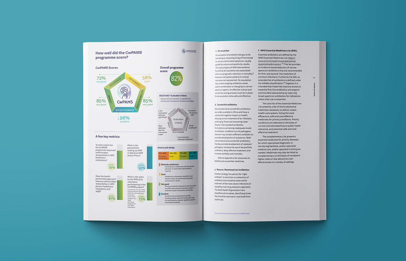
CwPAMS Score
Different pre-existing elements were re-designed and articulated into a single narrative explaining the CwPAMS scores. The colour scale for score levels was applied throughout, to aid visual digest and immediate interpretation of overall programme score.